This is the final official post (a little late than expected) for the OER Visualisation Project. In this post I’ll summaries the work and try and answer the questions originally raised in the project specification.
Over the course of the project there have been 17 blog posts, including this one, listed at the end and accessible via the ooh-er category. The project was tasked with two work packages: PROD Data Analysis (WP1); and Content Outputs (WP2). The nature of these packages means there is overlap in deliverables but I will attempt to deal with them separately.
PROD Data Analysis (WP1)
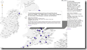
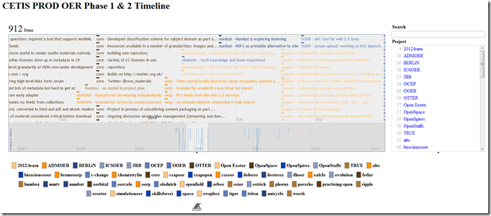
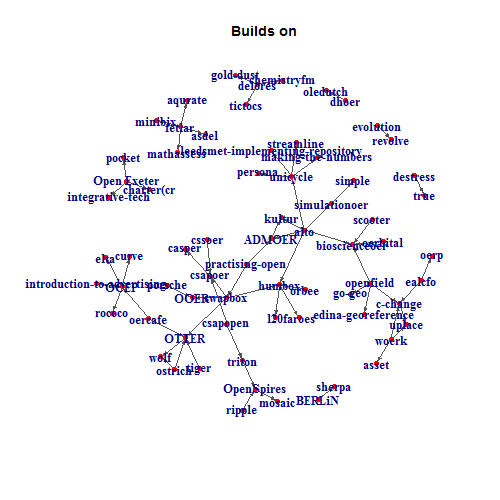
- Examples of enhanced data visualisations from OER Phase 1 and 2.
This part of the project mainly focused around process rather than product. It’s rewarding to see that CETIS staff are already using some of documented processes to generate there own visualisations (David’s post | Sheila’s post). Visualisations that were produced include: OER Phase 1 and 2 maps [day 20], timelines [day 30], wordclouds [day 36] and project relationship [day 8]
 |  |  |  |
- Recommendations on use and applicability of visualisation libraries with PROD data to enhance the existing OER dataset.
The main recommendation is that visualisation libraries should be integrated into the PROD website or workflows. In particular it is perceived that it would be most useful to incorporate summary visualisations in general queries for programme/strand information. The types of visualisations that are most useful would be the automatic generation of charts already used by CETIS staff in their summaries of programme information (histograms, bubble charts and word clouds). Most of these are possible using the Google Visualisation API. This may emerge as the most preferential library given Wilbert’s existing work with the Sgvizler library. The disadvantage of the Google Visualisation API is that the appearance of the charts is very standard and investment in a more glossy solution such as raphaelJS (used in WP2) might be considered. [Although I never got around to it I’m also still interested in investigating an entirely new navigation/exploration solution based on my Guardian Tag Explorer]
- Recommendations and example workflows including sample data base queries used to create the enhanced visualisations.
In the blog post on day 8 an example spreadsheet was created (which has been further developed) and shared for reuse. As part of this process an online document of SPARQL queries used in the spreadsheet was also created and maintained. Throughout the project this resource has been revisited and reused as part of other outputs. It has also been used to quickly filter PROD data.
This technique of importing SPARQL data has already been highlighted by CETIS staff but to move the idea forward it might be worth considering releasing a set of prepared spreadsheets to the public. The main advantage of this is there is a steep learning curve when using linked data and SPARQL queries. Having a set of spreadsheets ready for people to use should make PROD data more accessible, allowing people to explore the information in a familiar environment.
An issue to consider if promoting the PROD Datastore Spreadsheet is weather to make a live link to the PROD data or create as fixed data. For example, the mapping solutions from day 20 broke after PROD data was updated. Removing whitespace from some institution names meant that location data which was looked-up using a combination of fixed and live data failed to find the amended institution names. This is not so much an issue with PROD data but in the way the spreadsheet was developed. Consequently if CETIS were to go down the route of providing ready made Google Spreadsheets it should make clear to users that data might change at any point. Alternatively instead of providing spreadsheets with live data CETIS might consider release versions of spreadsheets with fixed results (this could be provided for programmes or strands with have been completed). Production of the static sheets could be achieved manually by uploading a collection of csv reports (sheets for project information, technologies, standards etc) or be automated using Google Apps Script.
In day 36 an additional workflow using a combination of R, Sweave and R2HTML was also explored. Using R opens the prospect of enhanced analysis of data being directly pulled via SPARQL queries to generate standard reports. The main question is whether there would be enough return in investment to set this up, or should the focus be of more lightweight solutions useable by a wider user base
- Issues around potential workflows for mirroring data from our PROD database and linking it to other datasets in our Kasabi triple store.
It was hoped that stored queries could be used with the Kasabi triple store but a number of issues prevented this. The main reason was the issue of exposing Kasabi API keys when using client side visualisations and in shared Google Spreadsheets. There was also an issue with custom APIs within Kasabi not working when they included OPTIONAL statements in queries. This issue is being investigated by Kasabi.
During the course of the project it was also discovered that this is missing metadata on comments stored as linked data. Currently general comments are the only ones to include author and timestamp information. For deeper analysis of projects it might be worth also including this data in related projects comments and comments associated with technology and standards choices [day 30b]
- Identification of other datasets that would enhance PROD queries, and some exploration of how transform and upload them.
No other data sets were identified.
- General recommendations on wider issues of data, and observed data maintenance issues within PROD.
Exploring PROD data has been a useful opportunity to explore it’s validity and coverage. As mentioned earlier geo data for institutions, particularly for the OER Programme, is patchy (a list of missing institutions was given to Wilbert). Another observation was whitespaces on data values prevented some lookups from working. It might be worth seeing if these could be trimmed on data entry.
Another consideration if CETIS want PROD data to be attractive to the data visualisation community is to natively provide output in csv or JSON format. This is already partially implemented in the PROD API and already available on some stored Kasabi stored queries using a csv XSLT stylesheet.
Content Outputs (WP2)
Before I mention some of the outputs it’s worth highlighting some of the processes to get there. This generally followed Paul Bradshaw’s The inverted pyramid of data journalism highlighted in day 16 of compile, clean, context and combine.
Two datasets were compiled and cleaned as part of this project: UKOER records on Jorum; and an archive of #ukoer tweets from April 2009* to January 2012 (the archive from April 2009 – March 2010 is only partial, more complete data recovered from TwapperKeeper exists for the remaining period.
UKOER records on Jorum
As the Jorum API was offline for the duration of this project an alternative method for compiling UKOER records had to be found. This resulted in the detailed documentation of a recipe for extracting OAI service records using Google Refine [day 11]. Using Google Refine proved very advantageous as not only were ukoer records extracted, but it was possible to clean and combine the dataset with other information. In particular three areas of enhancement were achieved:
- reconciling creator metadata to institutional names – as this data is entered by the person submitting the record there can be numerous variations in format which can make this processes difficult. Fortunately with Google Refine it was possible to extract enough data to match organisations stored in PROD data (made possible via the Kasabi Reconciliation API).
- extract Jorum record view counts by scraping record pages – a request was made for this data but at the time wasn’t available. Google Refine was used to lookup each Jorum record page and parse the view count that is publically displayed.
- return social share counts for Jorum records – using the sharedcount.com API social shares for a range of services (Facebook, Twitter, Google+ etc) were returned for individual Jorum records
The processed Jorum UKOER dataset is available in this Google Spreadsheet (the top 380 Jorum UKOER social share counts is available separately)
#ukoer Twitter Archive
The process of extracting an archive of #ukoer tweets for March 2010 to January 2012 was more straight forward as this data was stored on TwapperKeeper. Tweets prior to this date were more problematic as no publically complied archive could be found. The solution was to extract partial data from the Topsy Otter API (the process for doing this is still to be documented).
The #ukoer Twitter archive is available in this Google Spreadsheet
In the following sections the visualisations produced are summarised.
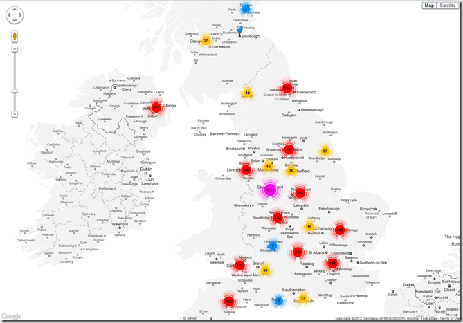
- Collections mapped by geographical location of the host institution
Title: Jorum UKOER Geo-Collections
About: Having reconciled the majority of Jorum UKOER records to an institution name, the geographic location of these institutions was obtained from PROD data. For institutions without this data a manual lookup was done. Results are published on a custom Google Map using a modified MarkerCluster Speed Test Example [day 20]
Type: Interactive web resource
Link: http://hawksey.info/maps/oer-records.html
- Collections mapped by subject focus/Visualisations of the volume of collections
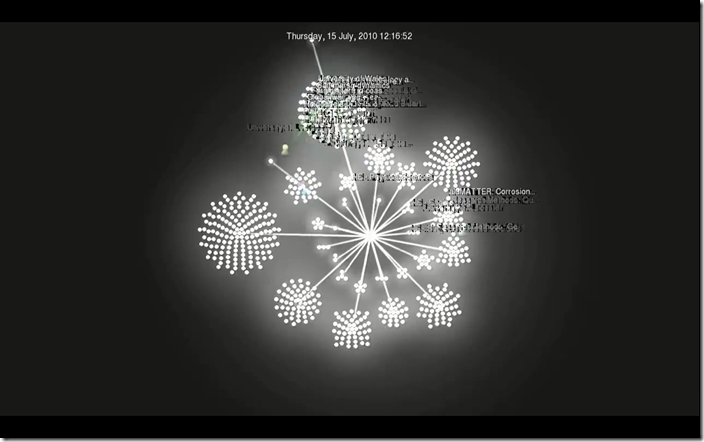
Title: Snowflake
About: Using data exported from Google Refine a custom log file was rendered using the open source visualisation package Gource. The visualisation shows institutional deposits to Jorum over time. Individual deposits (white dots) are clustered around Jorum subject classifications [day 11]
Type: Video
Link: http://www.youtube.com/watch?v=ekqnXztr0mU
Title: Jorum Subject Wheel
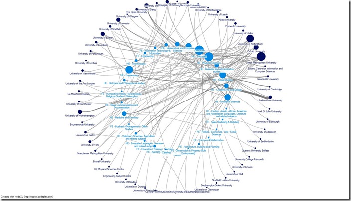
About: Generated in NodeXL this image illustrates subject deposits by institutions. Line width indicates the number of deposits from the institution to the subject area and node size indicates the number of different subject areas the institution has deposited to. For example, Staffordshire University has made a lot of deposits to HE – Creative Arts and Design and very few other subjects, while Leeds Metropolitan University has made deposits to lots of subjects.
Type: Image/Interactive web resource
Link: https://hawksey.info/wp-content/uploads/2012/02/SubjectCircle.jpg
Link: http://hawksey.info/nodegl/#0AqGkLMU9sHmLdFQ2RkhMc3hvbFRUMHJCdGU3Ujh3aGc (Interactive web resource)
Link: https://docs.google.com/spreadsheet/ccc?key=0AqGkLMU9sHmLdFQ2RkhMc3hvbFRUMHJCdGU3Ujh3aGc#gid=0 (Source Data)
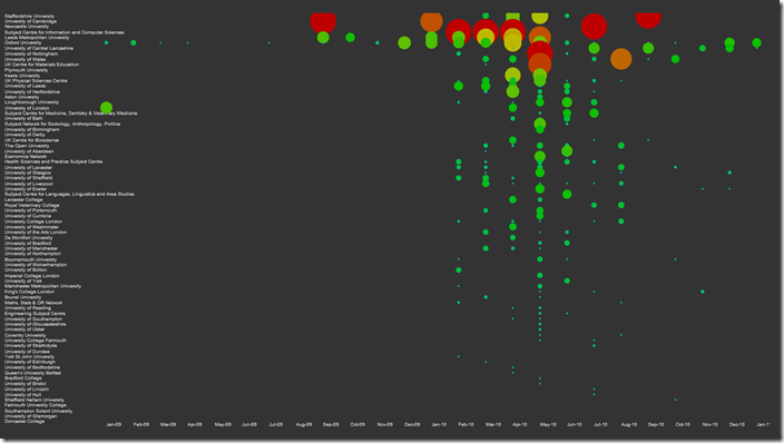
Title: Jorum Records Institutional Deposits Bubble Diagram
About: Creating a pivot report from the Jorum UKOER records in Google Spreadsheet, the data was then rendered using a modification of a raphaelJS library dots example. Bubble size indicates the number of records deposited by the institution per month.
Type: Interactive web resource
Link: http://hawksey.info/labs/raphdot.html
- Other visualisations
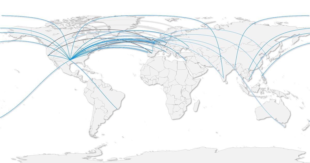
Title: CaPRéT ‘great circle’ Tracking Map
About: Raw CaPRéT OER tracking data was processed in Google Refine converting IP log data for target website and copier location into longitude and latitude. The results were then processed in R. The map uses ‘great circle’ lines to illustrate the location of the source data and the location of the person taking a copy [day 32].
Type: Image
Link: http://mcdn.hawksey.info/wp-content/uploads/2012/01/capret.jpg
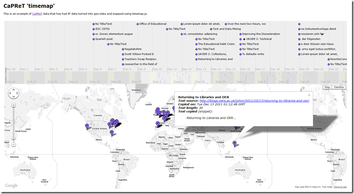
Title: CaPRéT timemap
About: Using the same data from the CaPRéT ‘great circle’ Tracking Map the data was rendered from a Google Spreadsheet using a modification of a timemap.js project example. Moving the time slider highlights the locations of people copying text tracked using CaPRéT. Clicking on a map pin opens an information popup with details of what was copied [day 32]
Type: Interactive web resource
Link: http://hawksey.info/maps/CaPReT.html
Link: https://docs.google.com/spreadsheet/ccc?key=0AqGkLMU9sHmLdDd5UXFGdEJGUjEyN3M5clU1X2R5V0E#gid=0 (Source Data)
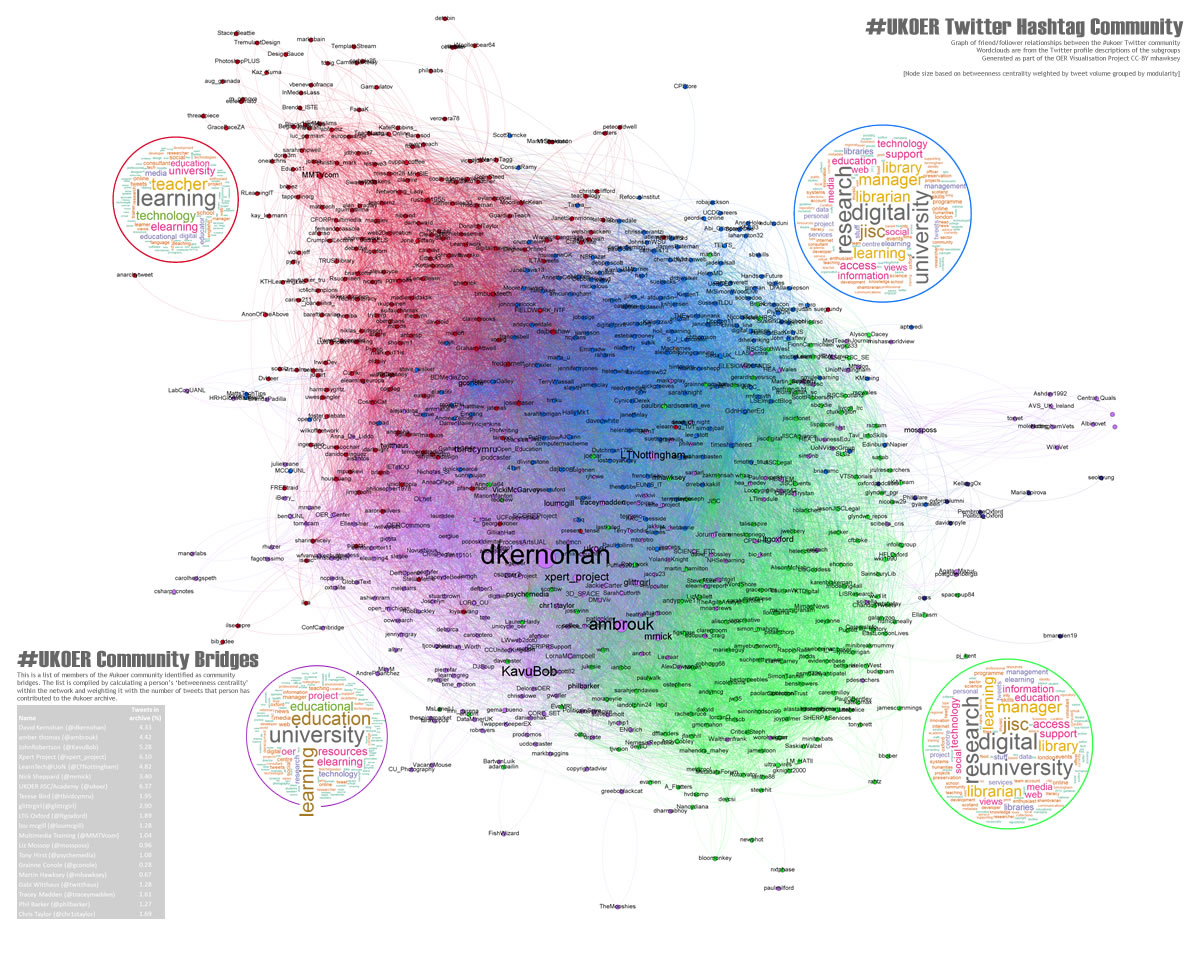
Title: The heart of #ukoer
About: Produced using a combination of Gephi and R ‘the heart of #ukoer’ depicts the friend relationships between 865 twitter accounts who have used the #ukoer hashtag since April 2009 to January 2012. The image represents over 24,000 friendships and node size indicates the persons weighted ‘betweenness centrality’ (how much of a community bridge that person is). Colours indicate internal community groups (programmatically detected). The wordclouds round the visualisation are a summary of that sub-groups Twitter profile descriptions [day 37, revisited day 40].
Type: Image/Interactive web resource
Link: http://hawksey.info/labs/ukoer-community3-weighted-BC.jpg
Link: http://zoom.it/6ucv5
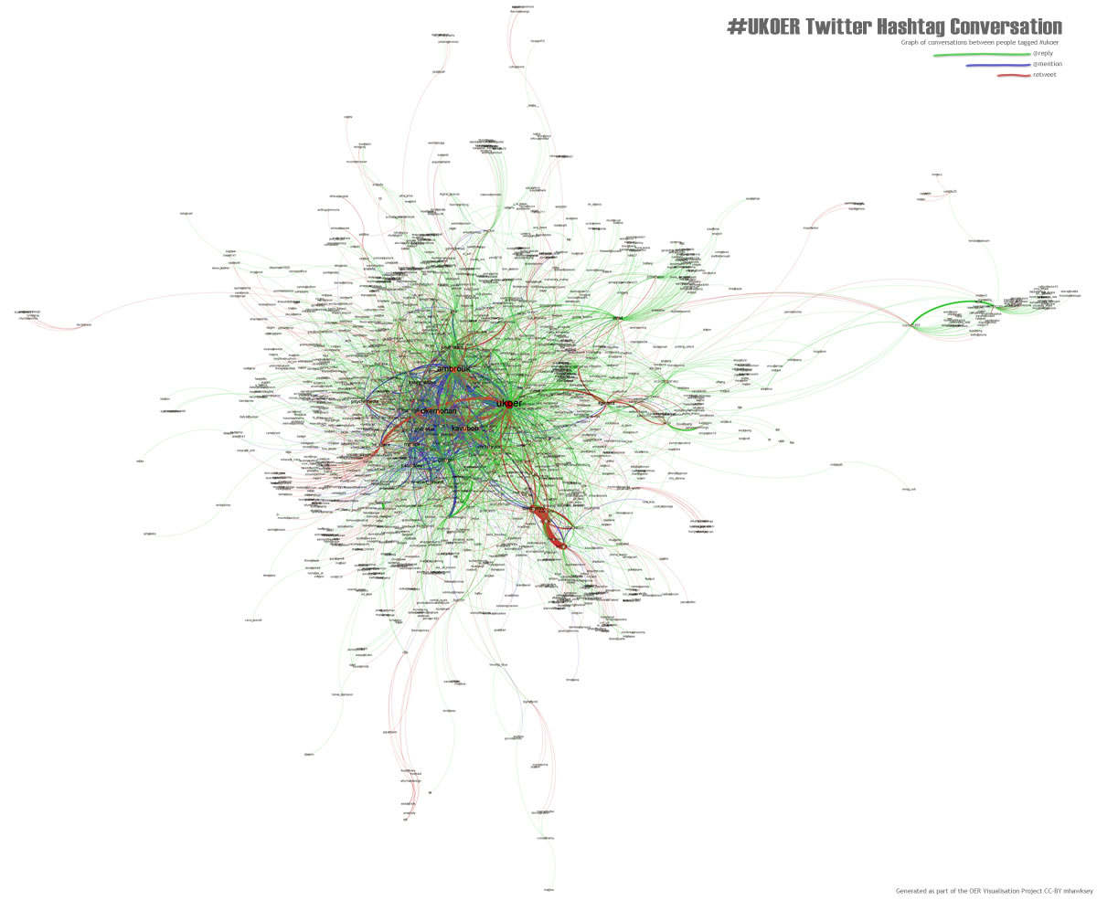
Title: The pulse of #ukoer
About: Produced using Gephi this image is a summary of the conversations between people using the #ukoer hashtag. Connecting lines are colour coded with green showing @replies, blue are @mentions and red are reweets [day 40].
Type: Image/Interactive web resource
Link: http://hawksey.info/labs/ukoer-conversation.jpg
Link: http://zoom.it/xpRG
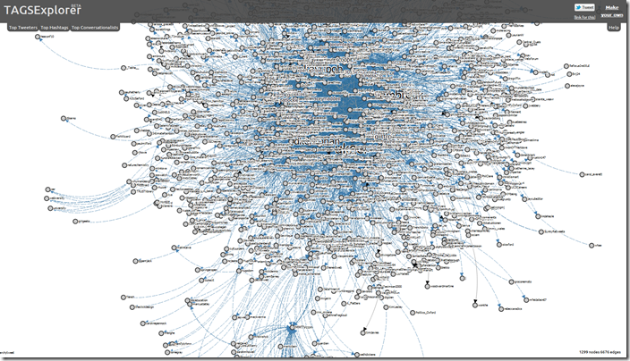
Title: Interactive ball of stuff
About: Using the same data from the ‘pulse of #ukoer’ an interactive version of the #ukoer twitter archive is rendered in the experimental TAGSExplorer. Click on nodes allows the user to see all the tweets that person has made in the archive and replay part of the conversation [day 40].
Type: Interactive web resource
Link: http://hawksey.info/tagsexplorer/?key=0AqGkLMU9sHmLdHRhaEswb0xaLUJyQnFNSTVZZmVsMFE&sheet=od6
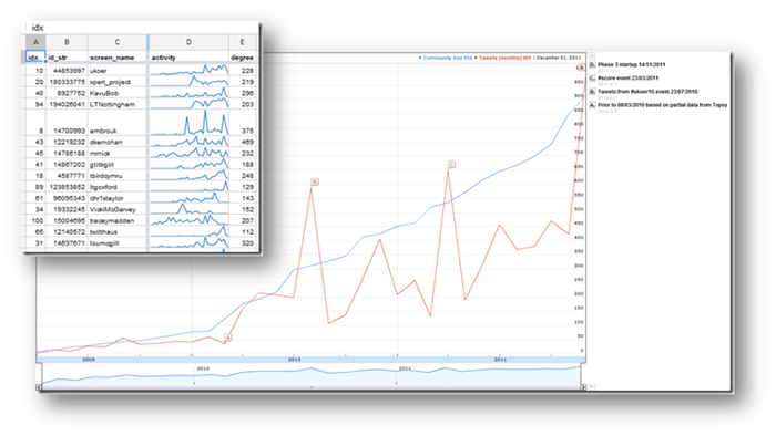
Title: Is there still a pulse
About: As part of the process of preserving #ukoer tweets a number of associated graphs used to detect the health of the #ukoer hashtag were produced. These are available in the Google Spreadsheet [day 40].
Type: Spreadsheet
Link: https://docs.google.com/spreadsheet/ccc?key=0AqGkLMU9sHmLdHRhaEswb0xaLUJyQnFNSTVZZmVsMFE#gid=3
Recommendations/Observations/Closing thoughts
The project has documented a number of recipes for data processing and visualisation, but in many ways has only exposed the tip of the iceberg. It is likely with current financial constraints repository managers will increasingly be required to illustrate value for money and impact. Data analysis and visualisation can help with both aspects, helping monitor repository use, but equally be used in an intelligence mode to identifying possible gaps and proactively leveraging repository resources. It was interesting to discover a lack of social sharing of Jorum records (day 24 | day 30) and perhaps more can be done in the area of frictionless sharing (see Tony Hirst’s draft WAR bid)
This project has mainly focused on Jorum and the #ukoer Twitter hashtag, due to time constraints as well as the amount of time required to compile a useful dataset. It would be useful if these datasets were more readily available, but I imagine this is less of a problem for internal repository analysis as data is easier to access.
Towards the end of the project focus shifted towards institutional repositories, some work being done to assist University of Oxford (and serendipitously Leeds Metropolitan University). If this work is to be taken forward, and this may already be a part of the OER Rapid Innovation projects, more work needs to be done with institutional repository managers to surface the tools and recipes they need to help them continue to push their work forward.
Whilst not a purposeful aim of this project it’s very fitting that all of tools and visualisation libraries used in this project are open source or freely available. This rich selection of high quality tools and libraries also means that all of the project outputs are replicable without any software costs.
An area that is however lacking is documented uses of these tools for OER analysis. Recipes for extracting OAI data for desktop analysis were, until this project, none existent, and as mentioned more work potentially needs to be done in this area to streamline the processes for compiling, cleaning and communicating repository data.
To help the sharing of OER data I would encourage institutions to adopted an open data philosophy including information on how this data can be accessed (the Ghent University Downloads/API page is an example of good practice). There is also a lack of activity data being recorded around OER usage. This is a well established issue and hopefully projects like Learning Registry/JLeRN can address this. It’s however worth remembering that these projects are very unlikely to be magic bullets and projects like CaPRéT still have an important role.
Was this project a success? I would say partial. Looking back at the selection of visualisation produced I feel there could have been more. So much time was spent creating recipes for data extraction and analysis, that it left little time for visualisation. I hope what has been achieved is of benefit to the sector and it’s reassuring that outputs from this project is already being used elsewhere.
Project Posts
- 40 days to let you see the impact of the OER Programme #ukoer [day 1]
- OER Visualisation Project: Adding a bit of SPARQL to make a UKOER map [day 2] #ukoer #ooher
- OER Visualisation Project: Processing a resource feed to find frequency using Google Spreadsheets [day 3] #ukoer #ooher
- OER Visualisation Project: Adding a bit of OAI-PMH collecting activity data in Google Spreadsheets [day 5] #ukoer #ooher
- OER Visualisation Project: Beginnings of linking data from PROD to Google Spreadsheet and early fruit [day 8] #ukoer
- OER Visualisation Project: Exploring UKOER/JORUM via OAI with Google Refine and visualising with Gource [day 11]
- OER Visualisation Project: Data Driven Journalism [day 16] #ukoer
- OER Visualisation Project: What I know about #UKOER records on Jorum and OER Phase 1 & 2 [day 18]
- OER Visualisation Project: Maps, Maps, Maps, Maps [day 20]
- OER Visualisation Project: How is OER being shared – Quick look at Jorum and #ukoer Twitter archive [day 24]
- OER Visualisation Project: How is OER being socially shared – postscript [day 30] #ukoer
- OER Visualisation Project: Timelines, timelines, timelines [day 30] #ukoer
- OER Visualisation Project: Visualising CaPRéT OER tracking data [day 32] #ukoer
- OER Visualisation Project: Exploring automated reporting using linked data and R/Sweave/R2HTML [day 36]
- OER Visualisation Project: The heart of #ukoer [day 37]
- OER Visualisation Project: The heart and pulse of #ukoer [day 40]
- OER Visualisation Project: Fin [day 40.5]
Sheila MacNeill
Wow – great work and great summary. I can’t stress enough how useful it has been for us to have you look at the PROD database in this project, I know only a small part of your work, but it has been incredibly useful. As you pointed out we have started building on your work already and your recommendations will be central to future developments.
S
David S
Hi Martin
I’ve really enjoyed your visualisation project. I’ve found it really interesting and lots of your posts have had really handy links or techniques that pointed me in the right direction.
Martin Hawksey
Hi Sheila/David I’m glad you’ve found the project useful. Next to distil it into a presentation for #cetis12
Thanks,
Martin
Good news: Got a full-time job at JISC CETIS – MASHe
[…] for John.My role will be part CETIS core work, part OER Programme Support Officer. Having just completed the OER Visualisation Project I’m sure there will be opportunities to continue parts of this as part of the programme […]
OER Visualisation Project: Fin [day 40.5] – JISC CETIS MASHe | New Learning - Ny læring | Scoop.it
[…] This is the final official post (a little late than expected) for the OER Visualisation Project. […]
Robert Farrow (@philosopher1978)
Really interesting stuff. I wonder whether anyone there would be interested in working with us to develop visualizations based on the data from the OLnet OER Evidence Hub (ci.olnet.org). We have a prestigious report coming out soon and it would be really good if we could include something like this. Complex data needs good visualizations!
Martin Hawksey
Hi – a key ingredient to this area of work is making the data available for others to play. I spend a lot of my own time trying exploring what can be done with Twitter because a lot of the data is easily accessible. It might be late in the day to make a read API for OLnet but even a Guardian Data Store style dump of the data into something like a csv file might encourage others to go and have a play 😉
Martin
#IWMW12 Data Visualisation Plenary/Workshop Resources JISC CETIS MASHe
[…] for use with pptPlex, but hopefully they still make sense). For the season I’m going to use the OER Visualisation Project to illustrate the processes required to get a useful dataset and how the same data can be […]
A Thousand Words « fragments of amber
[…] I love data visualisations: i first met social graphs through Tony Hirst’s OUseful, and that partly inspired Lorna Campbell and I to commission Martin Hawskeys Visualisation of the UK OER programme […]