As I mentioned in Filtering a Twitter hashtag community for questions and responses I’ve been asked to do some analysis of the Current/Future State of Higher Education (CFHE12) course. Week 1 has mainly been about creating a toolchain that makes it easier to hit a button and get some insight. The focus has mainly been on tweets with the #cfhe12 hashtag. I’m still scratching my head as to what this all means but there are already discussions to extend the scope trying to establish more context by also looking at blog and discussion forum posts. The danger I also have as a ‘maker of things’ as questions emerge I want to make things to help find the answers.
To easy into this lets start with an overview here are some key stats for 7-13th October 2012 (BST) (and already I resisting the temptation to create an overview template):
- 762 Tweets
- 305 Links
- 172 RTs
- 244 Unique twitter accounts
- 14% (n.104) of tweets were in @reply to another person using #cfhe12
This sheet contains more details including a summary of who tweeted the most and got the most @mentions and the ‘Dashboard’ sheet which let me know that this was the most retweeted tweet:
MOOCs, parochialism, and the taken for granted habit of assigned course readings:A blog post for #cfhe12: bit.ly/W3JPkN
— Kate Bowles (@KateMfD) October 13, 2012
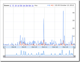
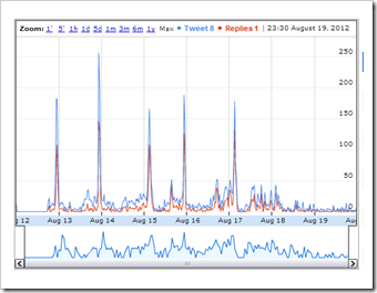
Below are two graphs summarising the Twitter activity for week 1 of #cfhe12 (LHS) and another course earlier in the year #moocmooc (you can click on both of these for interactive versions).
It’s notable that the volume and proportion of tweets and @replies is higher in #moocmooc. Part of this could be down to the fact that #moocmooc was a condensed course that was one week long. Other factors may include the chosen infrastructure and how this was promoted, size of course and who was participating.
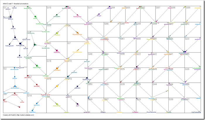
Extracting a conversation graph, which is shown below, there isn’t a great deal of @replies for week 1. In the graph each dot represents a single tweet and dots are joined if the person is @replying that tweet. I probably need to find a way for you to interact with this graph, but for now I’ve prepared these pages with conversations for groups G1-G4:

[The above graph data can be downloaded from the NodeXL Graph Gallery]
Exploring G3 and G4 some of the limitations of this technique become apparent. For example clicking on the date in the first tweet in G4 reveals the full text from Twitter, which includes text from G3 i.e. they are the same conversation and should be grouped together.
So more work to do, more things to think about, more tools needed to make sense of this easier. In the meantime any of your observations are greatly welcome.


CFHE12 Week 2 Analysis: Data! Show me your data and I’ll show you mine JISC CETIS MASHe
[…] http://mashe.hawksey.info/2012/10/cfhe12-week-1-analysis-twitter-isnt-so-massive/ […]