As recently mentioned on Sheila’s work blog the way the @jisccetis twitter account is evolving. Up until recently this account was used as a broadcast channel, pushing out latest news to followers and not following back. This was balanced by members of staff having personal twitter accounts, engaging with the community. As with any community there’s going to be overlap with common friendships and Phil Barker (@philbarker) suggested it would be good to see the extended JISC CETIS twitter follower network.
In this post I’ll introduce some sketches* with results to explore and show you how the data was extracted.
*this is a term I’ve picked up from Tony Hirst along with explanatory and exploratory visualisations both presented in More Thoughts on a Content Strategy for Data. The other thing I have sitting heavily in my thoughts is Eric Berlow’s TEDTalk where he shows complex doesn’t always mean complicated (H/T @PaulHollins). My fear is I’m going to dump you with complicated exploratory sketches, when I should be giving you a simple explanatory answers.
Dump #1 Blooming great

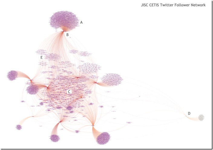
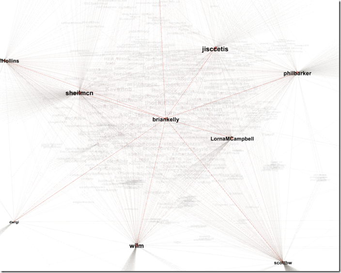
For this first dump I’ve deliberately left it as low resolution as I only want to give you an overview and not analyse each node. In the graph you’ll spot dense patches of purple [A] these are made of the individual twitter screen names of people following one of the CETIS twitter accounts. So at the very top of the image there is a cluster of people following just me [B]. Other dense patches represents other groups of people following other CETIS Twitter accounts. In the centre of the main group [C] are Twitter users who follow 2 or more CETIS accounts. In Gephi by rolling over nodes it’s easy to explore who people follow. To the right of the graph [D] is the @ArchimateTool account. This cluster has fewer connections to the main CETIS following. Finally around the centre of the graph are loose groups [E] of users who follow 2 CETIS staff.
Update: Some other stats. The average out-degree in the network is 1.424 and 81% of the people in graph only follow one of the CETIS accounts. It would be interesting to see how this compares with other organisations. It’s important to also remember it’s not just about twitter (email probably still has the best reach and conversion)
[If you are desperate to explore an interactive version of this I’ve put a copy on my install of Gexf-JS viewer.
Dump #2 Many Eyes
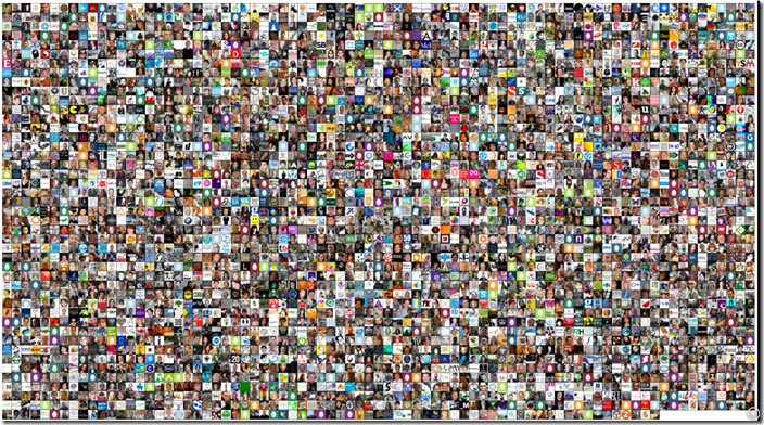
Overall there are over 3,500 unique Twitter accounts that follow one or more CETIS staff accounts. 3,500 pairs of eyes looking at what CETIS or staff members are doing, with the potential to spread our message even further through their own networks. Here’s what a lot of those eyes look like (click for larger version on zoom.it):

I suppose the next question is do we have the right Twitter audience watching us. A quick wordcloud of the profile description of the staff following us:

Getting the data
My regular top traffic generating blog post is Export Twitter Followers and Friends using a Google Spreadsheet which allows users to easily grab details of up to 5,000 (more if you don’t mind some code tinkering) Twitter account friend/followers. I don’t know how widely known it is but Twitter doesn’t just let you get your own friends/followers, you can get the data for any public Twitter account. So that’s what I did, snaffled details of who was following @jisccetis and JISC CETIS staff with public twitter accounts.
The way the spreadsheet is set up it generates a separate sheet for each persons follower details. To make it easy to import into Gephi/NodeXL I wrote this short script:
Here’s a copy of the modded spreadsheet. To use File > Make a copy, run through the authentication instructions, grab some follower details from different accounts then run Twitter > Combine follower sheets. If you’re going to be using Gephi last thing you should do before downloading as csv is change the column heading on the ‘combined’ sheet from screen_name to source.
Using Gephi
The best way I’ve found to get the data in Gephi is start a new project and then use the Import Spreadsheet option in the Data Laboratory pointing it to the csv file downloaded from Google Spreadsheet. I’ll let you play with manipulating the data. If you come up with any nice recipes please share 😉
Using NodeXL
Open a blank NodeXL template and then open the downloaded csv in Excel as a new workbook, then from the NodeXL ribbon Import > Open workbook. Its worth ticking the extra columns as vertex 1 properties. Again I’ll let you play, any recipes please share (the many eyes image was generated by switching the nodes to image and using the profile_image_url extracted using the Google Spreadsheet and using a grid layout. If anyone has worked out how to using images as nodes in Gephi I’d be very interested to hear).
So what
I avoided going into any deep analysis with this as there are probably internal discussions to be had, such as, should we be targeting college staff more? What I hope this posts illustrates is it’s relatively easy to extract this type of data and start to get the very beginnings of some answers (e.g. how many unique followers do we have). There still a lot to unpick in this area so I’m sure I’ll be revisiting. My question to you is if you were doing this type of study what answers would you be looking for?
Tony Hirst
@martin I stole the idea of sketches from NYT’s Amanda Cox …;-)
Btw, how did you generate the Twitter avatar grid?
Martin Hawksey
@tony yes I was struggling with my words on Friday I should have made that and how some of the graphs were made more explicit.
The avatar grid was made using NodeXL. NodeXL has the handy option to change node shape to image. The images can be unique for each node and defined by an image url. The friend/follower data extracted from Twitter includes the persons avatar image url. NodeXL also has a grid layout graph option so it was a case of using the and tweaking the node size to get all the avatars in without overlap.
[I did try using the =IMAGE() formula in Google Spreadsheets but gave up when I saw the the save as pdf option didn’t include the images in the output]
Visual Analytics: Comparison of @SCOREProject and @UKOER (and template for making your own) JISC CETIS MASHe
[…] with taking a copy of Export Twitter Friends and Followers v2.1.2 [Network Mod] (as featured in Notes on extracting the JISC CETIS twitter follower network).Authenticate the spreadsheet with Twitter (instructions in the spreadsheet) and then get the […]
Philipp
Is the script still working? I am struggeling with the aTest. The script says there is an error.
Philipp
Solved it. Didnt enter a callback url. Thanks for the great script