First I should say I don’t think this is the best solution, in fact an earlier post from 2008 DIY: A wi-fi student response system is probably a solution, if perhaps needing more tidying up, but I’m posting anyway just on the of chance that this might inspire or help solve someone else’s problem.
This post has come about as a result of a couple of things:
- I’m in a bit of a Google Apps run.
- I read and enjoyed Donald Clarks Clickers: mobile technology that will work in classes
- I saw and contributed to Tom Barrett’s crowdsourced X Interesting Ways to Use Google Forms in the Classroom (I added #39 Collaboratively building a timeline which I discovered through Derek Bruff’s class example.
Concept: Using Google Forms as an interface for a mobile/desktop based voting system.
Issue: If you are asking multiple questions the form needs prepopulating with options making it a long list for the student to navigate and potentially creating a predefined route of questions.
Solution: Use a generic form with one set of response options, the class using a unique question identifier for response graphs to be generated from.
The finished result
Below (if you aren’t reading this via RSS) is this Google Form. [You can make a copy of the related Spreadsheet and customise the text and options. For example, you might want to turn qID into a list option rather than free text.]
Loading…
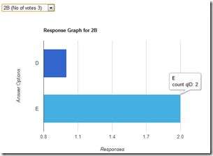
And here is a page with a summary of responses, which allows the user to choose which response set to display (screenshot shown below):
How it was done
Some of you might already be familiar with Google Chart. This service allows you to create chart images by encoding the data in the URL. I’ve used this service in a number of my mashups, in fact all of my previous voting mashups use it in some way, and not surprisingly in Generating charts from accessible data tables using the Google Charts API.
Google Chart works well if it easy for you to get the data and format it for the image URL. For more complex tasks there is Google Visualization. The advantage of Visualization is it gives you a way of querying a data source before displaying as a table or chart. To see what you can do (and the place where I aped most of the code for this mashup) you should visit the interactive gallery of Visualization examples.
Using the Using The Query Language example as a stating point I could see you could lookup data from a Google Spreadsheet and filter the response using Google Visualization API Query Language, which is very similar to SQL. What I wanted to do was SELECT the data from the spreadsheet WHERE it matched a question identifier and COUNT the number of occurrences for each GROUP of response options. An extract from the table of data is:
| A | B | C |
| Timestamp | qID | Answer |
| – | q1 | A |
| – | q1 | B |
| – | q1 | A |
My attempts to convert the SQL version of this query which is something like:
SELECT C, Count(C) AS CountOfC WHERE B = ‘questionID’ GROUP BY C
initially I was left with keyboard shaped indentations on my forehead trying to get this to work but Tony Hirst (@psychmedia) was able to end my frustration with this tweet. This meant I was able to use the following query VQL friendly:
SELECT C, Count(B) WHERE B = ‘questionID’ GROUP BY C
The next part of the problem was how to let the user decide which question ID they wanted to graph. Looking at the Simple Visualization example I could see it would be easy to iterate across the returned data and push out some html using JavaScript. What I wanted to do was GROUP the questionID’s and COUNT the number of responses, which is possible using:
SELECT B, Count(C) GROUP BY B
This returns a table of unique question IDs and a separate column with a count of the number of responses. A form list element is populated with the results using:
for (i=0; i
 var ansText = data.getValue(i, 0)+' (No of votes '+data.getValue(i, 1)+')';
 var valText = data.getValue(i, 0);
 ansSet.options[ansSet.options.length]=new Option(ansText,valText);
 }
And that’s it. If you want to play around with this the code is here. Enjoy and if you find this idea useful or if you spot any issues as always I value your comments.

Tweets that mention gEVS – An idea for a Google Form/Visualization mashup for electronic voting « JISC RSC MASHe -- Topsy.com
[…] This post was mentioned on Twitter by RSC Scotland N&E, Hash GA and hi!, Martin Hawksey. Martin Hawksey said: gEVS – An idea for a Google Form/Visualization mashup for electronic voting http://bit.ly/hhGXc4 #googleapps #google #visualization […]
Linking a Google Form with data from the responses in the Spreadsheet [Event/Resource Booking] JISC CETIS MASHe
[…] a way to access spreadsheet data using their query interface (I’ve used this previously in gEVS – An idea for a Google Form/Visualization mashup for electronic voting). The problem is to do this you need to make your entire spreadsheet publically available, okay for […]
Hacking stuff together with Google Spreadsheets: A simple electronic voting system JISC CETIS MASHe
[…] of me visiting the topic of electronic voting systems (clickers). The last time I did this it was gEVS – An idea for a Google Form/Visualization mashup for electronic voting, which used a single Google Form as a voting entry page and rendering the data using the Google […]