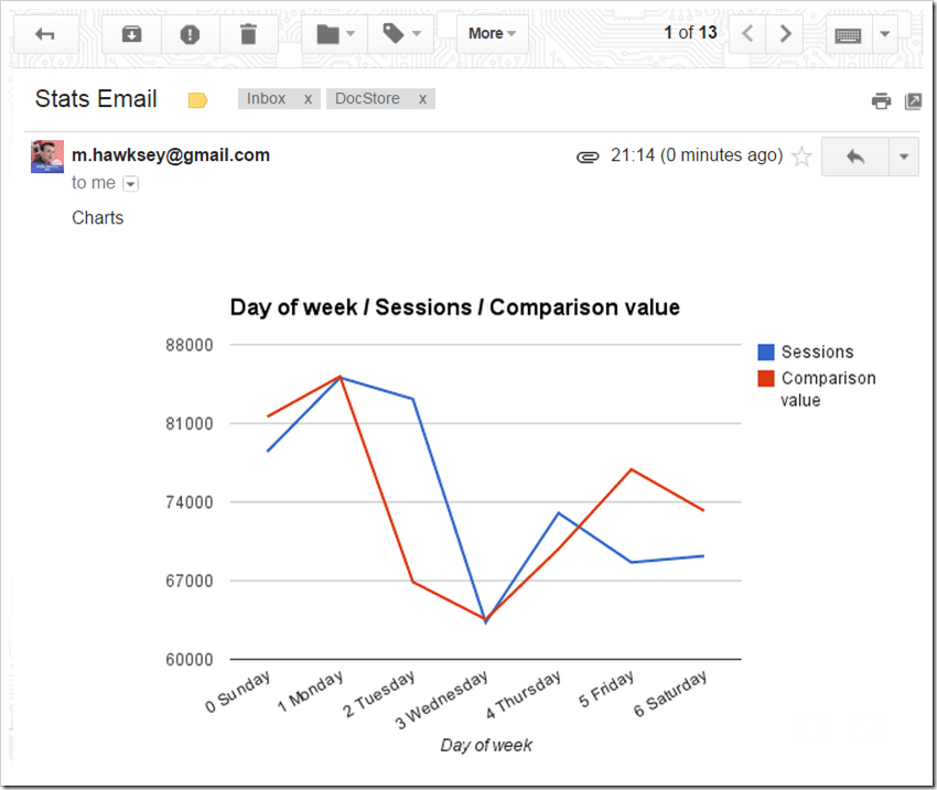
Previously I’ve written about how we use Google Apps Script to extract data from one of the Association’s online systems. We use this technique to generate charts which give us some insight to our current standing. One limitation we had was to view the charts we had to open the Google Sheet with them in. There are various techniques for automatically distributing these using Apps Script and in this post I’m going to highlight one method for emailing inline charts. Below is what the result looks like, an email with an embedded chart, no need to download or preview attachments.

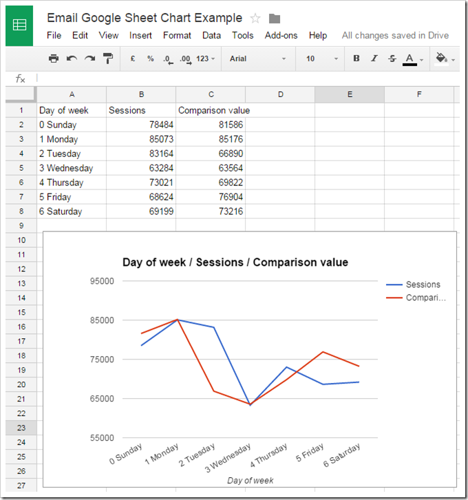
Below is the same chart in the Google Sheet. If we make changes to the chart appearance or update the data, when we send the chart we get the latest version.

I found the code snippet for doing this on Stackoverflow. This works well but there are two issues to be aware of.
Google Sheet needs to be shared with anyone with link
As noted in the SO comments for the chart to appear the Google Sheet containing it needs to be shared with ‘anyone with the link’. Without this all you get is a blank image. This potentially creates a data protection issue if using sensitive information. There are ways you can juggle this by such as using the IMPORTRANGE formula to only publish aggregated data. This looks like a bug which I’ve noted in this issue ticket.
Missing numeric labels
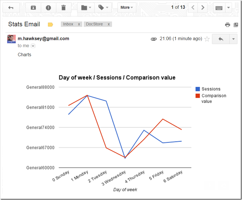
The second issue we discovered was that axis with numeric values end up prefixed with ‘General’ e.g. as seen below General88000.

The solution is fairly straight forward and actually opens the door to doing a lot more with charts. It uses the EmbedChartBuilder service to grab the chart object. The original Google announcement for the Chart services highlights you can:
- Add/Remove the ranges this chart represents via
addRangeandremoveRange. - Set options that modify how the chart will be rendered as well as change the chart type with
setOptionandsetChartType. - Change where the chart will be displayed (the cell and cell offset of the chart container) via
setPosition.
To achieve proper axis formatting requires some cross document reference lookup to find the correct setOption to use. In this case it means jumping to Google Chart API reference for Line Charts to see the configuration options and setting the format:
builder.setOption('vAxis.format', '#');The modified version of the function we use is included below: