Moving away from social networks I wanted to discover how Brian Kelly’s UK Web Focus, Tony Hirst’s OUseful.info and my MASHe are linked together. I chose Brian’s and Tony’s blogs for this because they have highlighted my work in the past so I know I’ll get some data. The main reason for this exercise was to learn more about NodeXL (learning through enquiry).
So where to begin. The biggest lesson from the last week is forced network diagrams generally just need an edge list which contains a start and end vertex for each data point. So to see how the three respective blogs are linked together I need to build a list of links that take you from A to B.
Previously with my other work using Google Spreadsheets to capture social engagement I’ve imported the sitemap from a site to get a list of posts. I’ve also used Google Apps Script to iterate across this list fetching each post to get additional information. It’s therefore relatively straight forward to grab each post and extract all the links the author has made. (One of the tricks though is instead of getting the public post webpage which has lots of other links for navigation is to instead get the xml version. Fortunately Tony has recorded how to get a Single Item RSS Feeds from WordPress Blogs by appending ?feed=rss2&withoutcomments=1 to the post url (it also fortunate that all three of us use wordpress blogs)).
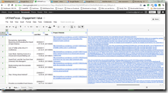
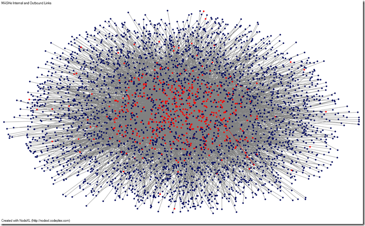
Initially I tried importing this data (one for each blog) into NodeXL and filtering it only for the three respective blogs but it appears Excel only allows two custom filter criteria. You can get around this but doing some filters then deleting rows, but I found it easier just to add a couple of lines of Apps Script to filter the generated list (also because Tony and I have changed domain names in the last couple of years additional criteria are required for old domain urls).
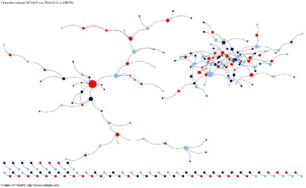
Here’s the final data set of links between UK Web Focus, OUseful.info and MASHe. From this point you can pretty much follow my Getting started with the @WiredUK friends network post to generate a basic graph. Here’s what I came up with:
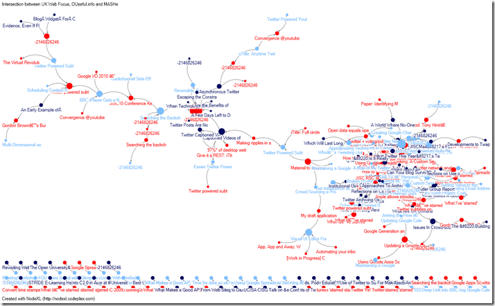
[Key: red – MASHe; dark blue – UK Web Focus; light blue – OUseful.info
Initially because the nodes are urls adding labels completely obliterated the network diagram. NodeXL has an option to truncate labels but this would just give domain names so I added a lookup converting urls to post titles and truncated these instead –still not ideal.
Within NodeXL you can add tooltips and menu actions making navigation and analysis of the data a lot easier. Here’s a quick screencast to show you how this is done:
[It would be great if NodeXL had a way of publishing graphs whilst maintaining some of this interactivity, a bit like the way I can embed basic Twitter networks using the Hirst-Hawksey Protovis (Friendviz) Google Gadget. After I tip from Tony I had a look at the D3.js library which has superseded Protovis. I had a go at changing the data source in this example by adding a custom column to the Edges sheet in NodeXL with =”{source: “””&[@[Vertex 1]]&”””, target: “””&[@[Vertex 2]]&”””, type: “”licensing””},” but which generated something – more tweaking required]
Here’s a clean view of how the posts are linked. The grouping on the left are these collection of posts we did on the Twitter Video Subtitling concept, which show a progression and branching of the topic.
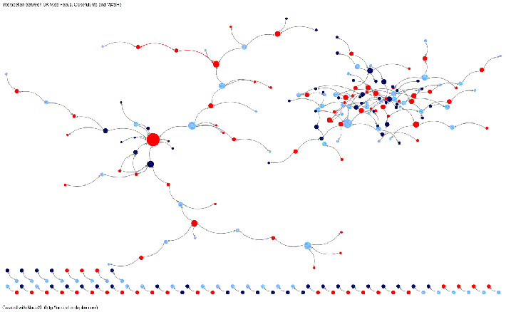
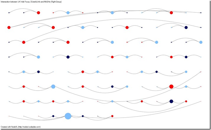
Exploding the right cluster into a grid view (shown below) reveals that while there are post threads these are clusters of 3/4 posts (again this is a bit meaningless because I’ve got no way of labelling the nodes). The remaining posts have a single edge.
What does this all mean?
Who cares, pretty pictures 😉 I was more interested in learning the process, practical application to follow. Unless you have any ideas?
If you want to do similar make a copy of this spreadsheet and have a look at Tools > Script editor… and here’s also a copy of the NodeXL file and as .graphML
PS Turns out Tony was doing something similar about a year ago (doh!). Tony said:
Here’s a script i tried once to look at internal trackbacks in wordpress…http://bit.ly/cLSQIu
I even considered trying to start thinking “academically” around it at one point… http://bit.ly/cgk7zO
original reason for me looking at graph was to in uncourse justification context http://bit.ly/oq4IpB
[I’ve pre-expanded those links for trackback ;)]
PPS Also Brian has related a guest post today Web archives: more useful than just a ‘historical snapshot’
A template for rendering small NodeXL visualisations on the web using the d3.js « MASHe
[…] I had rendering NodeXL generated data in a scalable vector graphic based webpage. In my post The art of discovery: Looking at how UK Web Focus, OUseful.info and MASHe interconnect using Google … I said:It would be great if NodeXL had a way of publishing graphs whilst maintaining some of this […]