The other tool that I got wind of just after SocialBro was Network Overview, Discovery and Exploration for Excel – NodeXL. As indicated in the title NodeXL is an add-on for Microsoft Excel (Windows version) but the code is free and open source. Here’s the description from the website:
For a while I’ve been admiring Tony Hirst’s work visualising large networks like Twitter communities using the open source and cross-platform tool Gephi. Tony has lots of great posts for getting you started with Gephi including Visualising Twitter Friend Connections Using Gephi: An Example Using the @WiredUK Friends Network.
I’d been put off cooking something up myself until now because a) Tony has been doing a great job and I couldn’t see what I could add b) large network visualisations need large amounts of data (Tony has previously published his Twitter Community Grabbing Code – newt.py, but as I’m not whitelisted with the Twitter API I only get 350 hits/hr and not 20,000 which can be somewhat of a hindrance when getting follower relationships).
The advantage of NodeXL, particularly for graphing Twitter communities, is it has built-in features for grabbing the data for you. Not only that the coding is clever enough to handle the data collection for mere mortals, so when you hit your rate limit NodeXL waits until it should be able to get more data. NodeXL also has “built-in connections for getting networks from Flickr, YouTube, and your local email. Additional importers for Exchange Email, Facebook, and Hyperlink networks are available”.
To let you see how to use NodeXL and to allow me to make comparisons with Gephi I thought I’d re-run Tony’s WiredUK example (besides why should I break my habit of only ever building on Tony’s work ;).
In Tony’s original post the beginning (getting the data) is at the end. Fortunately with NodeXL we can start here. I’m assuming you’ve downloaded and installed NodeXL so we begin by starting a new template – I do this from the Windows Start menu and selecting the NodeXL Excel Template shortcut from the Microsoft NodeXL application folder. From the NodeXL ribbon select Import > From Twitter Users’s Network. In the import dialog box enter:
- Get the Twitter Network of the user with the username: wiredUK
- Add a vertex for each: Person followed by the user
- Levels to include: 1.5
- and what level of authentication you want to use

Once the data has been collected (you can see updates in the status bar of the import dialog box), when you click ‘Show Graph’ you’ll get the raw form:

At this point Tony highlights that:
Sometimes a graph may contain nodes that are not connected to any other nodes. (For example, protected Twitter accounts do not publish – and are not published in – friends or followers lists publicly via the Twitter API.) Some layout algorithms may push unconnected nodes far away from the rest of the graph, which can affect generation of presentation views of the network, so we need to filter out these unconnected nodes. The easiest way of doing this is to filter the graph using the Giant Component filter.
NodeXL has some ‘Dynamic Filters’ that include bounding the graph by x and y which could be used to crop the image, but I couldn’t find a component filter

Next Tony colours the graph using “the modularity statistic. This algorithm attempts to find clusters in the graph by identifying components that are highly interconnected.” NodeXL doesn’t have a built-in function for calculating ‘modularity’ but we can cluster nodes into groups using other algorithms, in this case Clauset-Newman-Moore. From the Groups menu make sure this algorithm is selected then click ‘Group by Cluster’

When you Refresh Graph you’ll see the nodes have been colour coded as per group.

If you navigate to the Groups sheet there is a column where this colour is set (the right-click to set the colour doesn’t work for me but with the cell highlighted you can use the color picker within the Visual Properties part of the ribbon (top-right of the screenshot below)):

In Tony’s example he says: “While we have the Statistics panel open, we can take the opportunity to run another measure: the HITS algorithm. This generates the well known Authority and Hub values which we can use to size nodes in the graph.” NodeXL doesn’t have a statistics panel as such but can calculate some but not as man
y metrics.

Next Tony looks at graph layout. In NodeXL there aren’t as many options but enough to get started with (I stuck with Fruchterman-Reingo). To add Twitter IDs and have a varying node size we Autofill the Visual Properties. As NodeXL doesn’t have a HITS algorithm I’m using Betweeness Centrality (for an explanation of this see Sheila MacNeill’s Betweenness Centrality – helping us understand our networks post).

Within the Graph Options there are some further adjustments you can do like changing the joining lines to curves and adjusting the label font (unfortunately the font-size is fixed, it’s just the node icon that scales relative to the betweenness centraility.

It’s still hard to see what is going on, but we have some more layout tricks. To start with we can layout graphs for groups in separate boxes and also adjust the strength of the repulsive force.

Once you’re happy if you right click on the graph there is an option to save it as an image.

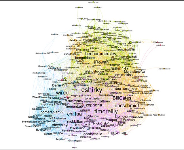
And here is the final result

and for comparison here’s what Tony produced

Which is better Gephi or NodeXL? For entry level (if such a thing exists given the number of different algorithms and theories in network analysis) NodeXL ticks a lot of the boxes. Its easy to grab data and do basic processing. If you want to do more you might want to switch to Gephi. The good news is NodeXL can export the data files in Gephi supported formats so potentially you can get the best of both worlds.